Transforming Insurance Data Collection
Cognitive Clarity
COMPANY
Zuo Insurance
ROLE
UX designer
EXPERTISE
UX/UI Design
YEAR
2024
Project Overview
In this case study, I redesigned the data collection experience for an insurance agency, focusing on reducing cognitive load and improving usability for both clients and agents. The project aimed to streamline the process, increase form completion rates, and enhance overall user engagement. And with that I was able to achieve
Reduced Call Times Agents completed forms 35% faster (average call time dropped from 12 minutes to 7.8 minutes), freeing up time for other tasks.
Increased Form Completion Rates Clients found the new forms easier to navigate, resulting in a 22% increase in completion rates (from 68% to 90%), and significantly fewer dropouts.
Enhanced User Confidence Post-redesign surveys showed that 87% of agents and 81% of clients felt more in control and confident with the process (up from 54% and 49%, respectively).
Streamlined Operation Errors decreased by 40% due to automated validation checks and e-signature capabilities (error rate dropped from 10% to 6%).
Project description
This project focused on transforming Zuo Insurance’s legacy data collection process by leveraging cognitive load theory and systems thinking. The goal was to design a seamless and intuitive form that reduces complexity for both clients and internal agents, ultimately increasing completion rates, reducing errors, and streamlining the workflow.
Challenge
Outdated, overwhelming forms resulted in high dropout rates, frequent errors, and lengthy, frustrating experiences for both agents and clients.
Ways of working
Applied cognitive load theory and systems thinking to research user needs, map end-to-end journeys, and design a dual-view form interface—addressing pain points and optimizing usability for all stakeholders
My Approach
Dual-Sided Solution
While working on this project, I identified an opportunity to create a solution that addressed both sides of the problem:
Employee View: Redesigning the agent-facing interface to simplify navigation and reduce cognitive overload.
Customer View: Developing a similar form that clients could easily complete on their own, minimizing abandonment rates.
Research Insights
I conducted in-depth research on cognitive load management theories, including:
Hick’s Law: Simplifying decision-making by reducing choices.
Miller’s Law: Breaking information into manageable chunks.
Progressive Disclosure: Revealing information step-by-step to avoid overwhelming users.
These principles informed every aspect of my design process.
Design
Current vs. Improved Journey
I mapped out the current user journey to identify pain points:
Long call times for agents
Overwhelming forms for clients
Repeated follow-ups due to incomplete submissions
The improved journey focused on
Digital pre-fill processes
Guided form completion
Real-time validation checks
Faster submission with e-signature capabilities
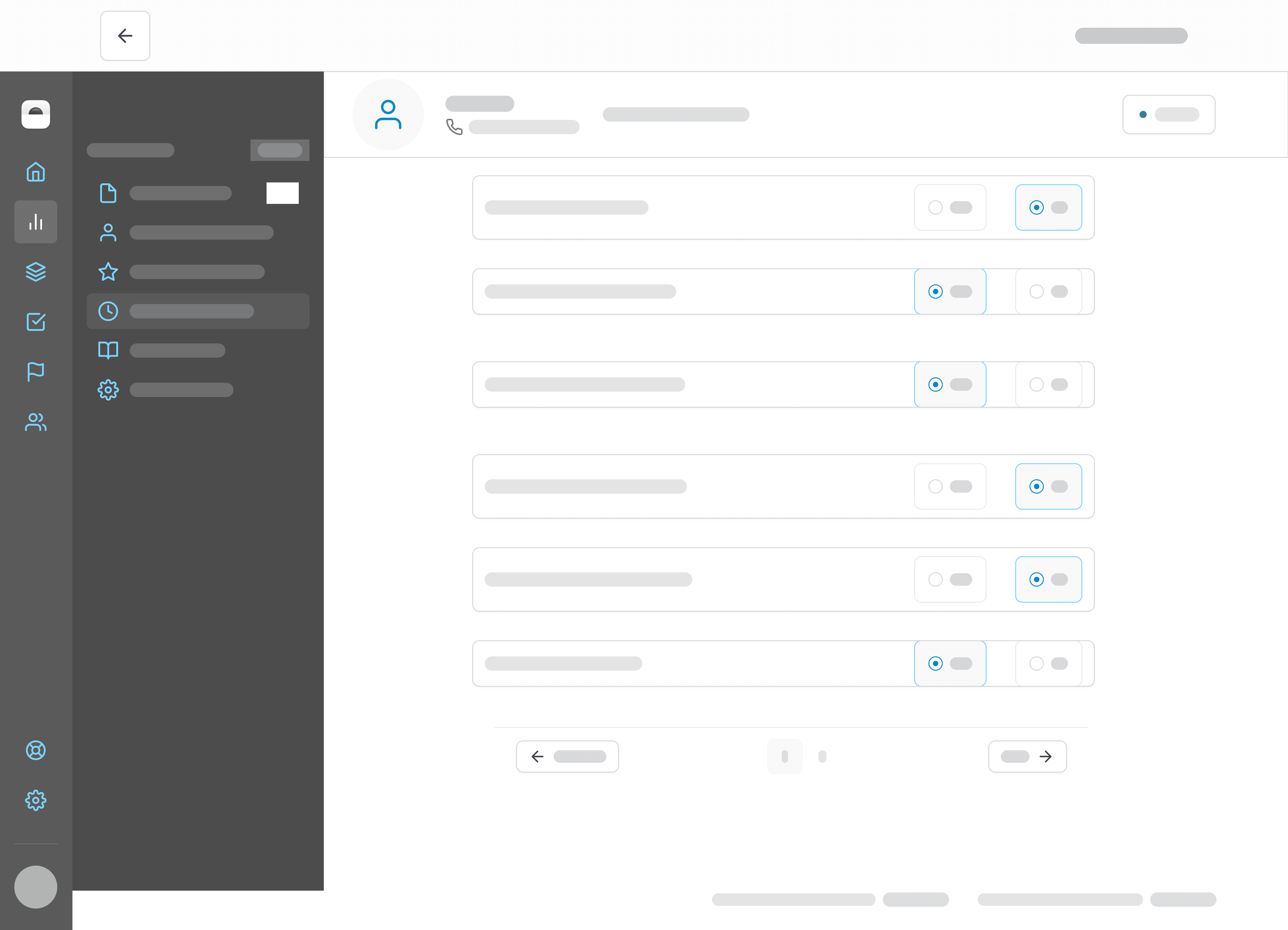
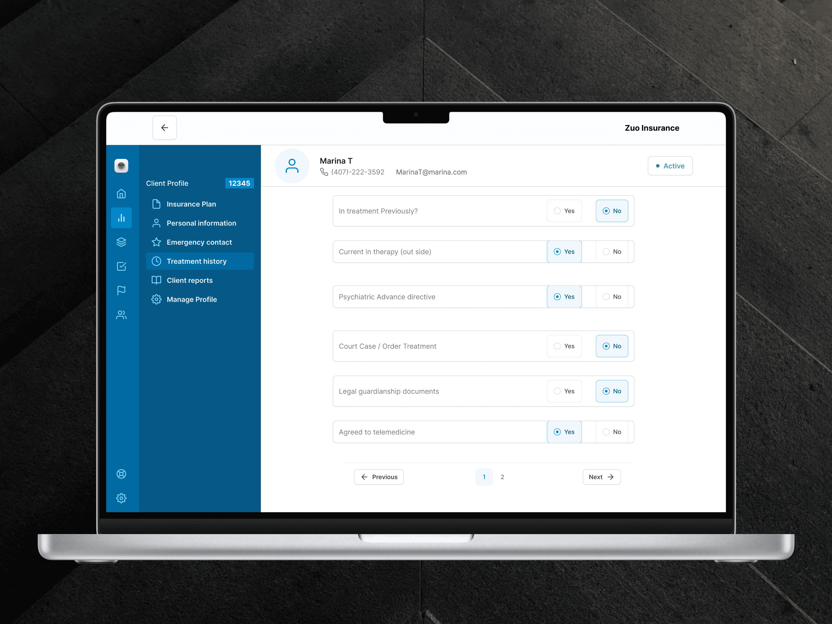
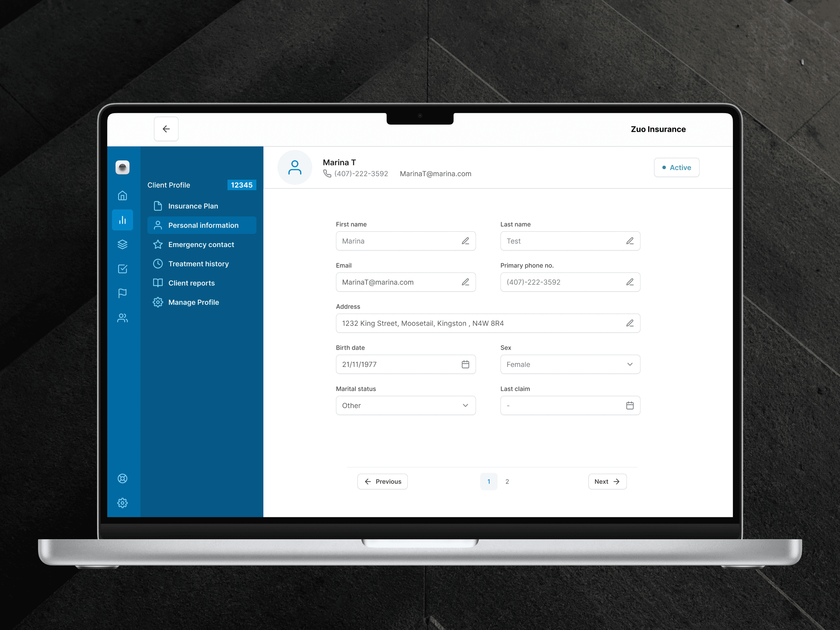
Wireframes
Using Figma, I created high-fidelity wireframes showcasing both the employee and customer views:
Agent Dashboard
A clean, intuitive interface with quick access to client profiles and streamlined navigation.
Client Form
A dynamic, interactive form broken into bite-sized sections with progress indicators and live support.
Solution
Dual-Sided Design: Simplifying Insurance Data Collection Through Cognitive Load Management
Key Features
To reduce cognitive load and improve usability, I implemented:
Smart Interactive Forms:
Auto-fill functionality and real-time validation checks.
Progress Indicators:
Visual cues to help users track their progress.
Dynamic Adaptation:
Forms that adjust based on user responses.
Confirmation Summary:
A final review step before submission, enhancing confidence.

Results
The redesigned experience delivered measurable improvements
Reduced Call Times:
Agents completed forms 35% faster (average call time dropped from 12 minutes to 7.8 minutes), freeing up time for other tasks.Increased Form Completion Rates:
Clients found the new forms easier to navigate, resulting in a 22% increase in completion rates (from 68% to 90%), and significantly fewer dropouts.Enhanced User Confidence:
Post-redesign surveys showed that 87% of agents and 81% of clients felt more in control and confident with the process (up from 54% and 49%, respectively).Streamlined Operations:
Errors decreased by 40% due to automated validation checks and e-signature capabilities (error rate dropped from 10% to 6%).